
Do not use colours as the only information medium
For people with colour vision deficiency and all those who use e-book readers
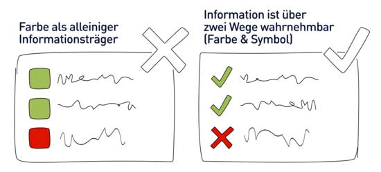
Colour design should never be the only way to convey information.
The classic way of visualisation is certainly: green = right, red = wrong. For example, a text marked in green is intended to illustrate that the information contained in the text is correct. A text marked in red is intended to illustrate that the information contained in the text is incorrect. This visualisation becomes a problem for people with red-green visual impairment.
What can you do?
Never use colours as the only way to convey information. Instead, use a combination of colour and symbol to convey the relevant information. For example, a red cross could be placed in front of text that is intended to convey incorrect information. A green tick could be placed in front of the text that is supposed to represent correct information.
In the following places, also make sure that identification is not exclusively by colour:
- for headings and links in a text
- e.g. headings also have a different font or font size,
- links are underlined or additionally displayed with another symbol (e.g. arrow)
- mandatory fields and error messages in forms
- mandatory fields are often additionally marked with an asterisk
- error messages could be marked with an additional symbol (e.g. exclamation mark)
- for selected menu items on a website
- the selected menu item is also underlined or labelled with an icon
This not only removes barriers for people with colour blindness, but also for those who use, for example, an e-book reader to read in greyscale.
A good illustration of colour vision deficiencies
can be found under “Thinking of everyone – Color Vision Deficiency” (opens in new tab) – a campaign on digital accessibility on the HessenHub blog (Hessen Digital University Teaching Network)